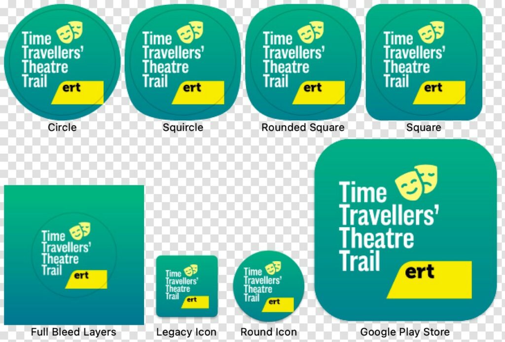
Your app icon is a very important marketing asset. Its design can be the difference between your app being instantly recognised or simply overlooked. Create an icon that’s instantly recognisable on search listing pages and a user’s home screen.
Consider the following four tips for creating an app icon that stands out from the crowd.
1. Use one letter, not words
Words can be hard to read on an icon that sits next to many others on a user’s home screen. Lots of words are not going to have the space to be clear. Opt to use just one letter e.g. the first letter of your company or brand instead.
2. Use a unique and/or simple shape or symbol
Your app will be competing against many others, whether a user is browsing the app store or scrolling through their home screen. Avoid cramming lots of colours or images into your app icon. Keep it simple. The best icons focus on one element or concept rather than trying to jam every feature into a tiny icon – remember it needs to work at large (app product page) and small (user’s device) sizes. You want to achieve clear and instant recognition — if someone needs to squint to make out the details of your icon, you’re not accomplishing your goal.
3. Contrasting colours
First and foremost ensure the shape, symbol or letter is well contrasted against the app icon background colour. Using vibrant colours will help your app stand out in the app store, against the other apps a user has installed and against their own background/wallpaper image. Using a contrast colour checker can ensure you meet minimum contrast ratios to deliver accessible content.
Choose your icon background colour carefully. Blue is the most common favourite colour in the world, so companies have capitalised on this and you’ll find many app icons are blue. Therefore, you risk blending in with your competition by choosing blue for your icon.
4. Give your app icon space to breathe
You’ll have noticed that Apple icons have rounded corners. This effect is applied by your app developer so you don’t need to round off your corners before supplying your icon, but you need to consider how this will affect your design. And don’t forget that Android icons can be square, round or a squircle (a square circle). Leave space around the sides for these crop marks.
In an ideal world the yellow block in the bottom right corner of each icon below should extend to the right and downward to work for all icons. In this form it looks like it is floating when the idea was to cover the full corner (which it does on iOS).

Benefits of a Curated App Icon
Enhancing the aspect of your app icon can impact your app’s success more than you can imagine. Here’s a list of reasons why it benefits your brand’s effectiveness:
Brand Identity
Custom icons that match a brand’s color scheme and style can be used for company apps, providing a cohesive look that reinforces brand recognition.
Improved Discoverability
In app stores, a good app icon can stand out among thousands of others, increasing the likelihood of attracting potential users. A clear and appealing icon can make the app more noticeable, which is especially important in crowded app marketplaces.
Encourages Downloads
An attractive and professional-looking app icon can influence users’ decisions to download an app. If the icon looks well-crafted and appealing, users may perceive the app as being of high quality, increasing their willingness to try it out.
Differentiates from Competitors
In competitive markets, a unique and creative app icon can differentiate an app from similar ones. A distinct icon can help an app stand out, making it more memorable for users who are comparing multiple options.
Conveys the App’s Purpose
A well-designed icon can communicate the core function or purpose of the app at a glance. By using appropriate symbols, colors, or imagery, the icon can give users an idea of what the app does, which can help in setting the right expectations.

Designing an app icon
If you are planning to design the app icon yourself and you don’t have access to paid design products like Sketch (which comes with app icon templates), Photoshop or Illustrator there is now another software solution. At the end of 2021 Adobe released Creative Cloud Express, a quick and easy web and mobile app that’s perfect for designing app icons and many other creative assets. Creative Cloud Express offers access to millions of photos, fonts, templates, graphics, and other assets that give you a head start on any project. Best of all, it’s free to use.
Your app icon will need to be designed 1024 pixels x 1024 pixels. Your app developer will then output the icon for the app in all its various guises and sizes. Use the tips above to design the perfect app icon to ensure it will stand out above all the noise.
If budget allows then why not ask us to design your app icon and take away the hassle.